Mobile SEO Countdown: What Factors Will Google Use After April 21?
 by Nelly Vinnik | March 18, 2015
9 min to read
by Nelly Vinnik | March 18, 2015 
The digital world is flooded with Mobile Spring Madness and the only way to overcome it is to fall for it. Since the latest Google announcement about its intent to include mobile-friendliness as a ranking factor after an April 21st update, the mobile readiness of your site is no longer optional; it is imperative. In the new age when the average amount of traffic that comes from smartphones is from 30% to 50% (depending on business niche), the fact that your website rankings can benefit from mobile optimization is heartwarming and challenging. Sure, you don’t want your website visitors to take flight at the first sign that your mobile website lacks user-friendliness. This can prevent you from benefitting from a large portion of highly-converting mobile traffic. Just so you know:

The truth is hard to swallow and it depends on you what sugar will be added to the spoon.
While webmasters’ spring mobile usability cleaning is in full blast, Google is going the extra mile improving and synchronizing their mobile usability testing services and webmaster mobile optimization guidelines.
What makes the mobile version of a site different from the desktop?
In the mobile version it is critical to properly optimize font size, make links thumb clickable and buttons thumb-friendly, adjust your content so it easily adapts to different screen sizes and perfectly flows into a small viewport. When it comes to the mobile optimization of your site, there are two things that are crucial: user-friendly mobile design and mobile content optimization. The question is, in what case and why would the website be flagged as non user-friendly when considering its content and design parts.
We decided to test one of our client’s websites for how it works on mobile devices and how well it is ranked on mobile SERPs. The website Elegantflyer.com provides PSD templates for freebie flyers (handouts such as for events), premium flyers and the ability to customize them. After I typed in one of the most popular query phrases “Free PSD Flyer Templates”, I found our website in question in the 14th position on the second page of search results. Not bad given the fact the website has existed for less than a year.

Google has labeled it as a mobile-friendly website. However, when we checked all the important pages of the site on a mobile device, most of them seemed not to be as friendly as labeled by Google. We came across some critical issues with the unaided eye:
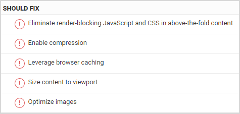
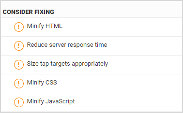
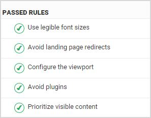
The mobile SEO audit of Elegantflyer was run with the help of the Web CEO Mobile Optimization tool and the Page Speed tool. This helped us to identify technical issues that prevent the site from working well on mobile devices.
The initial mobile SEO report showed that the site is responsive, has no Flash content and its page speed score is 41/100.
In the detailed report, we found 5 critical issues, 5 issues considered to be fixed and 5 passed rules.
The question hangs in the air: “Why did Google label the website as mobile-friendly, while some of its pages were not mobile optimized and crammed with some critical SEO issues? Might it be that Google labels (ranks) the website taking into account the overall website usability score, not the page-by-page optimization score? We have delivered our recommendations to the website owner of the Elegantflyer website and will check it for any SEO improvements and its ranking position changes when the update rolls out.
No matter, what Google puts under consideration when assigning a mobile-friendly status, you should fix some of the common mobile usability issues and make sure each of your important landing pages meets mobile search standards. Otherwise Google may play with your pages in an Eenie-Meenie-Miney-Moe counting game.

You chose a wrong mobile website configuration option.
Though Google doesn’t take into account responsive design, it highly recommends that you use a responsive design option as this is the most cost-effective and simple technique to adjust your website content to the screen size of different devices and keep both desktop and mobile content on the same URL for a better user experience. Another option that would perfectly work for both desktop and mobile is responsive design with adaptive features. The responsive design with adaptive logic is a great way to dynamically specify the form of content in order to maximize the usability (reading content without reordering and resizing) for mobile users. This is one of the dynamic serving design options. Here you can read about the pros and cons of all mobile site configuration options, such as responsiveness, dynamic serving, mobile site version, mobile app or WordPress responsive themes.
Your mobile site has a lack of intuitive navigation.
Your mobile site navigation should meet the main mobile user experience principal:
less thinking, linking, scrolling – more traffic, conversions and sales.
Your top navigation menu should contain no more than 3-4 lines with drop-down pages to link. The search option glass and a quick home page link in the form of a logo in the upper left corner of the page are the default requirements.
Your mobile site uses an illegible font type.
Don’t wreck your users’ nerves and don’t strain their eyes by unreadable and tiny text size. Google recommends that you use a 16 CSS pixel font size. Use proper media query settings to make your fonts easy-to read and adjustable for any device screen.
Some of the CSS, JS elements and images are blocked from crawling because of the robots.txt. file configuration.
Blocking CSS, JS, images and wireframes from your robots.txt.file is now considered a bad SEO practice. If the areas are inaccessible for Googlebots they will not be indexed properly. As a result you will lose additional rankings for these lost content pieces. Google has just added the Blocked Resources Report to its Google Webmaster Tools usability issues block.
Some of your pages are too slow.
The reasons for a slow page response may be different. Test your page speed score and eliminate all the issues that may decrease the quality of your users’ experience on your mobile site.
Mobile content is not properly adjusted to the size of a viewport.
Make sure you use a meta viewport tag in the head of each page’s code. The meta viewport value (width=device-width) placed within the tag will automatically instruct the page to fit any device screen’s width so the content is rendered with appropriate dimensions and scaling.
Your mobile content “tap targets” are poorly optimized.
There are some above-the-fold content areas (buttons, ads, forms, links) on your mobile site that call for interaction with users. These tap targets should be large enough (48 CSS pixels or 7 mm) to meet mobile-friendly standards and should have enough room (32 CSS pixels or 5 mm) around to avoid frustrating the user experience. Read more about optimal tap target recommendations for a better user experience.
Your mobile site has too many non-optimized and time-consuming redirects.
There are 3 types of redirects:
For the best mobile user experience, we recommend that you get rid of all the redirects. The worst scenario of using multiple redirect chains is the high bounce rate of your website. Time-consuming redirect lag times between user-agent and web server may add extra seconds to load a page. You will be very lucky if a user that landed on your site has good patience and a good temper. Learn more about mobile redirect optimization here.
Your website is weighted by unfriendly Flash content.
The problem with Flash content is that it is impossible to index it organically. Mobile devices can’t render it at all. Moreover, Flash can cause multiple violations of modern search engine standards, including mobile usability and search indexing. It is recommended that you avoid building or embedding any Flash-based objects into your mobile site content.
Your content is filled with poorly optimized images.
Image usage in mobile search is crucial. Since images are among the most popular forms of content on the web, they cover a lot of space on websites. Make sure you follow the image optimization best practices from Google in order to reduce their size and keep them in high quality on any device type.
Don’t delay your website mobile optimization or, if your website is already labeled as mobile-friendly, be sure to check your newly added, or updated website pages for mobile usability issues. You can get such analysis accurately delivered by the Web CEO Mobile Optimization reporting tool.