Mobile SEO in 12 Steps: Get Optimized for 2025
 by Brian Gareth | February 4, 2025
14 min to read
by Brian Gareth | February 4, 2025 
Fun statistics for you: in January 2025, mobile devices brought 64% of worldwide Internet traffic.
It’s quite a compelling argument for why we need mobile SEO – even with laptops and PCs still around. Pretty much everyone has a phone these days, which is how mobile devices drive well over a half of global Internet traffic. No site owner worth their salt can ignore that.
Because traffic means sales.
That’s why optimization for mobile devices is a must. The question is, how to be good at it?
Mobile SEO (and SEO in general) lives or dies by the user experience. There’s only one real secret to it: make your site easy to use on mobile devices, which makes mobile SEO mostly technical in nature. That’s not to say the rest of SEO like keywords, backlinks and competitor analysis aren’t part of it; we’ll just focus on what makes SEO for mobile devices special.
Let’s begin.
Have you ever seen URLs like this?
That small m. in front of a website’s URL address. They usually appear only when you are surfing the Web from mobile. This m. subdomain is separate from the primary domain and (in most cases) is made specifically for mobile users. By splitting themselves in two, websites aim to provide optimal user experience for both types of audiences – desktop and mobile.
Does it really improve the user experience?
Possibly, yes.
Is it good for SEO?
Definitely not.
There are way too many SEO-related problems when you create a separate m. subdomain. You need to set up redirects between the two versions so the users would always arrive at the correct versions, and it’s easy to mess up with redirects. You end up splitting traffic and authority between your desktop and mobile sites, which helps neither. And there are all the potential duplicate content issues, too…
Long story short, m. subdomains are very SEO-unfriendly.
So what should you do instead?
Simple: don’t create one. Focus on making your primary domain mobile-friendly. It’s entirely possible to give both desktop and mobile users good user experience on the same domain, and in fact, it’s much easier than setting up a separate mobile subdomain.
And here’s how you do it.
A responsively designed web page will adapt itself to a screen of any size. Automatically. See how much more preferable it is to manually designing a mobile version of your site?
If you are curious what it looks like, behold and be in awe:

Of course, while a responsive design does its job without being told to, you still have to set it up with your own hands. Which, fortunately, is not that hard.
A responsive design includes:
Once you are done with them, don’t forget to check if it worked. There are resources like Responsive Website Design Tester which can test your site for being responsive on various devices: phones, PCs and tablets alike.
(Interestingly, Google doesn’t categorize tablets as mobile devices. I wonder if we are going to need tablet-friendly SEO?)
How important is page load time? Where to start…
That’s pretty important. Certainly not something you want to sleep on. Especially since mobile users are even less willing to wait for web pages to load than desktop users, bouncing off after a mere 3 seconds.
The goal is clear, then: make your site load fast! Follow these steps:
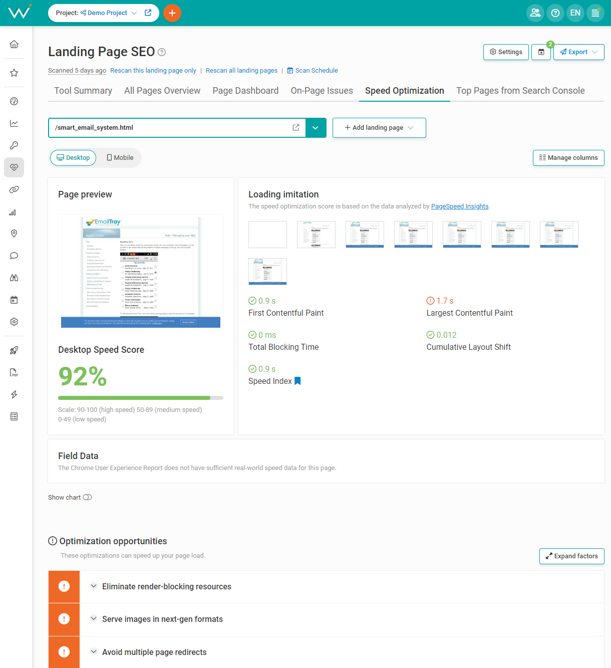
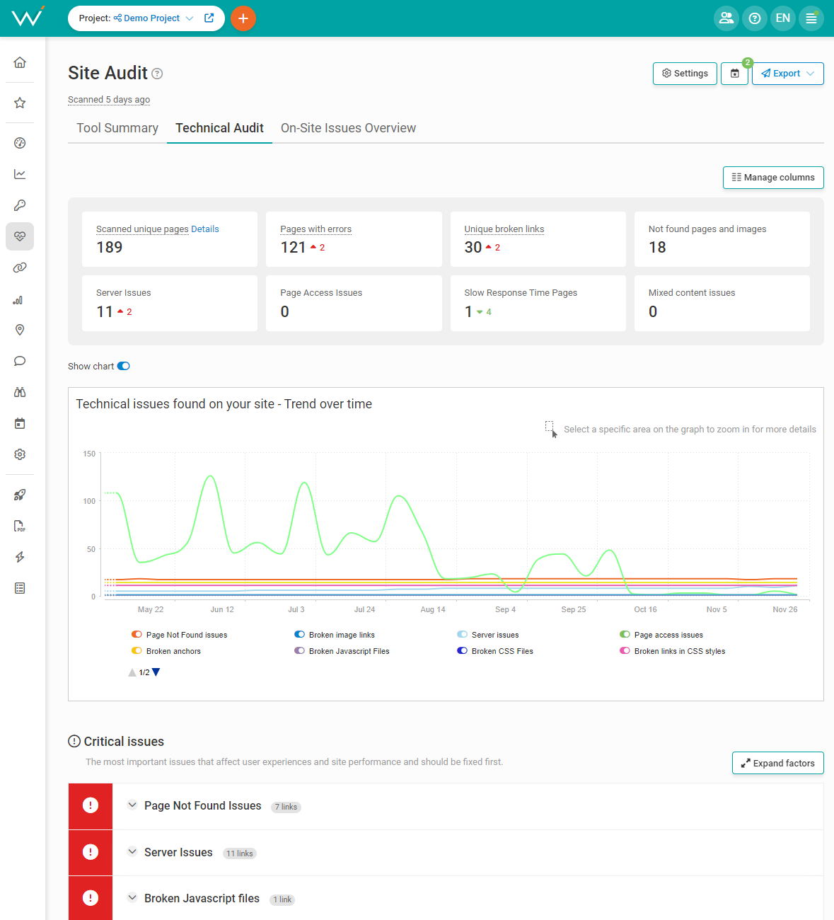
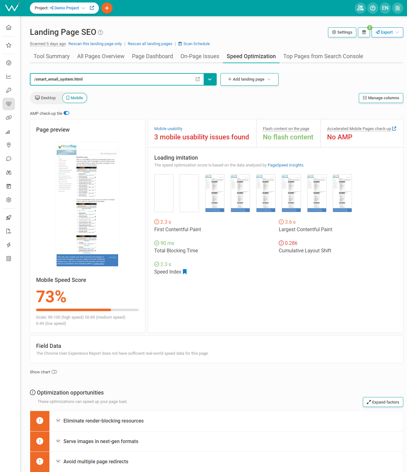
Find out what slows you down with WebCEO’s Speed Optimization tool. Your loading speed is vital to mobile SEO and your rankings, so you should check it at least once every week. Set the tool to scan your site automatically.
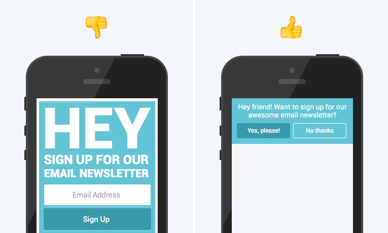
Compare these two web pages as seen from a smartphone screen:
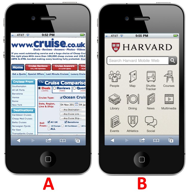
Which one of them looks better? 95% of the readers will choose B 100% of the time. That clearly demonstrates what users prefer to work with.
But users’ preferences aren’t the only reason why this option is superior. The other reason is the defining feature of smartphones that PCs don’t have: touch screens.

Instead of a mouse and a keyboard, you use your fingers to directly control what’s on the screen. And that’s when you run into a problem. Poking the screen with your finger is easy and fun, but poking it with accuracy? If you don’t have slim fingers, you are going to need a lot of skill to master that.
Unless the webmaster solves this problem for the users. In our case, you are the webmaster. This task is entirely on you!

All you need to do is leave some space between the interactive elements. Just a little room to breathe, and users won’t press anything they didn’t want to by mistake. In fact, they’ll even be more motivated to use your site. A comfortable design makes users feel safe and relaxed, unlike cluttered designs.
Users are people, and people work in simple ways. If you are mindful of their needs, they will make themselves at home on your site.
Websites are mechanisms. They do everything mechanisms do: run on their own with minimal input, perform tasks they were made for, and break from time to time. When that happens, there’s not much to do but tend to the problem.
Fortunately, not everything that can break on a website can cause you to go out of business. Some issues can be pretty minor:
Okay, that went somewhere bad really fast. Bottom line: don’t ignore these issues. What if you let them pile up, and then something serious happens? You just won’t find it in the long list of errors. Don’t let that happen to you.
Scan your site for errors with WebCEO’s Technical Audit tool…
And then fix what you’ve found. When your site works smoothly and your users are happy, you can sleep easier.
Adobe Flash Player is a rich source of fun. It’s a bit outdated now, but it’s still good at what it does. You’ll rarely run into any trouble with it on PC. I’ve lost count of how many Flash games I’ve played. Those were good times…
But in the present, Flash’s relationship with phones is less than cordial. What’s the problem? Simple: most phones can’t even support it. Some can, but what are the odds your users will be among those lucky owners?
So in order to make your site mobile-friendly, it’s best to avoid using Flash on it altogether. If you need special effects, HTML5 is a great alternative.
How would you like it if a pop-up suddenly appeared while you were reading this post?
I doubt you’d enjoy it. Nobody wants their fun on the Internet to be interrupted by pop-up ads.
Yes, sites have to pay for their hosting somehow and all that jazz… Users don’t care. They are interested in what you can give them, not in what they can give to you.
So all you can do is make your pop-ups less intrusive. It’s especially important for mobile devices: their small screens have too little space for content as they are.
Your options are:
a) Stop using pop-ups altogether. Not recommended if you have calls-to-action you want to show. In that case, instead…
b) Make your pop-ups smaller. Then you can put them somewhere they won’t get in the way and obstruct too much content. For example, like this:
Certain types of pop-ups get a free pass to cover the screen due to their importance, such as:
Though your users will still be grateful if you let them easily dismiss those pop-ups too.
This is where you raise your eyebrows and say, “Come on Brian, this is too obvious. It doesn’t need to be said.” But you’d be surprised how easy it is to screw up this part, and how many site owners do.
First, let’s define important content: it’s content you really don’t want your users to miss. It’s everything you want them to see, otherwise they might as well not visit your site.
There are two principles to follow:
1. Make your content easy to see;
2. Don’t hide your content.
The first one is easy. All you need to do is make sure your content can be clearly seen on a mobile screen without having to zoom in. That means large, easily readable text and large images where you can clearly see every detail.
Now, onto the second part: hiding content. Why hide it at all? Some webmasters do it to selectively display only certain parts of content to their users depending on the device they use.
Here are a few ways to hide content. Don’t do these:
At best, hiding content hurts the user experience. In the worst-case scenario, Google may think you are cloaking your content and issue a manual action. Neither is good for your rankings.
Would you click on a search result you couldn’t read?

I bet you wouldn’t. And your users wouldn’t, either. But wouldn’t that be a problem for you?
Everyone wants to get clicks from Google, and I’m sure you share the sentiment. So if you plan to show your site in search results, avoid having your URLs, titles and descriptions cropped at all costs!
It’s true for desktops and even more so for phones. That’s because character limits are tied to the type of device that displays them. For example, in the case with meta descriptions, their desktop length is up to 158 characters, while their max limit on mobile devices is 120 characters.
But making do with less is one of the most useful skills you can have in SEO.
If your site runs on WordPress, you can use various plugins to help yourself stay within character limits, such as Yoast SEO. Alternatively, there are online tools like Google SERP Snippet Optimization Tool by Blackhatlinks and Google SERP Simulator by TechnicalSEO.
Social media’s effect on SEO is not as strong as many believe. However, it’s not zero either. You absolutely want to use it for promoting your site, and there are plenty of big reasons why:
Do these benefits sound good? Of course they do. If they have convinced you to integrate social media on your site, let’s continue.
In order to turn social media into your ally, you will make a few adjustments to your site. The easiest way to do it is to install a few WordPress plugins that can do these things:
People often use their phones to find cafes, restaurants, and other local establishments. If your website isn’t ready to welcome mobile users, you risk losing a significant amount of potential customers. This makes having a mobile-friendly website a must for local businesses.
This includes not only making a responsive design, but also several other elements that will need a bit of upgrading:
The same goes for ecommerce websites. The process of purchasing any goods or services can be optimized with simple payment forms, an easy and fast way of exploring products, and ways to quickly contact the support team.
Video is one of the most popular formats of content. Videos are literally everywhere! But if you want to implement them on your website, do it wisely. Rather than upload a video directly on your site, use a platform specifically designed for the job: YouTube, Dailymotion, Vimeo, Twitch or any other. Then you will simply need to embed those videos on your site.
You can upload your own videos or use somebody else’s. Just remember about attributing their original creator.
What are the advantages of embedding videos?
What do you think? It’s actually pretty easy to make your site mobile-friendly, isn’t it? Once you follow the steps above, you’ll just need to make sure it stays that way.
Make it a habit to regularly scan your site for mobile SEO-related issues. You can easily do it with WebCEO’s Mobile Optimization tool.
Then it’s only a matter of maintaining your site’s mobile-friendliness at top level.
And that’s what mobile SEO is made of. We’ve been told that it’s going to get especially huge in the coming new decade so many times, even folks without online access have heard it. The only way this prognosis can fail is if another revolutionary technology appears and changes the Internet as we know it.
Can it happen in our lifetime? It’s fun to imagine, that’s for sure. But right now, mobile SEO is the most certain bet you and I can take.
