SEO for Web Designers: How to Design a Site That Ranks
 by Brian Gareth | June 4, 2025
11 min to read
by Brian Gareth | June 4, 2025 
Making websites is easy. You don’t even need to be a web designer for that. However, professionals have standards, and web designers certainly do as well. When you need a website made, you turn to somebody who is good at it – and not just because you care how it will look.
A good web designer does more than just create a pretty-looking website. While they don’t have control over the biggest Google ranking factors (such as content and backlinks), they can ensure the appearance and functionality are SEO-friendly, and thus contribute to site rankings.
Alright, enough throat clearing. Here’s the recipe for uniting SEO and web design.
Text is an integral part of any website, and not just because it’s the most convenient way to relay information. Search engines rely on text to understand and evaluate the websites’ content.
Of course, your content itself needs to be as high-quality as possible. Content quality is one of the major SEO factors, which puts a great responsibility on its maker. But to increase content’s visibility in search engines even further, you need to optimize it with keywords – words and phrases which people use to find whatever they want online.
You know, phrases like “SEO for web designers.” Chances are, you found this very article in Google by typing those words or something along those lines. And this article appears in Google because it has “SEO for web designers” in the title.
Are you starting to see the pattern?
Here’s how you find and use keywords.
And a few more recommendations to make sure your keywords don’t backfire on you:
Just remember: content comes first. As long as you dedicate a page to a specific topic, you will see how easy it is to use keywords without even trying.
Web pages are connected with each other via links. And while there’s any number of ways to interlink your pages, most webmasters prefer not to experiment with it – and rightly so. There’s already a tried and tested method which is the most efficient and SEO-friendly:
Together, the pages form a hierarchy of sorts, based on how users look for information and gradually narrow down their search. It can be displayed in a diagram like this:
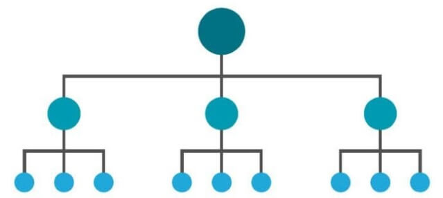
What makes this structure so SEO-friendly? Because most of the time, people link to the homepage more often than to anything else. This advantage gives the homepage the highest authority score – and that can be passed down to the other pages on the domain.
What else can you do to give your site’s structure more SEO edge?
And most importantly, every site structure needs working links to function properly. No 404 errors nor faulty redirects are allowed. Find broken links on your site and fix them.
Every single search result you see in Google is an indexed page. If a page hasn’t been added to Google’s index, it does not appear in search – and I assume you don’t want that to happen to you.
Fortunately, it’s very easy to index any website’s pages, no matter how many. All you need to do is create a sitemap (a list of all pages on your site) and help Google find it.
How and where?
That’s it! Takes about 5 minutes to do.
Note that certain pages should never be indexed, like robots.txt. To make a page invisible to search engines, add this line to its HTML code:
<meta name=”robots” content=”noindex”>
Conversely, the pages you actually want to appear in search must never have this line.
One last indexing tip: search engines often struggle with detecting hidden content on pages – for example, if it’s put behind a collapsible tab.
Perhaps one of the most important steps designwise: making sure your site works perfectly on every kind of device. To do that, you need to make your site’s design responsive – i.e. make it automatically adapt to a screen of any size.
One way to do it is to install a plugin like WPTouch or JetPack. But plugins are a third-party resource, so a more reliable option is to do it yourself.
How do you do that? There’s a whole lot to making a responsive design, and chances are, you will not need to use every trick in that book. But the two absolute must-haves for SEO are the viewport and responsive images. Those are fairly easy.
The viewport is the user’s visible area on the screen. When your viewport isn’t responsive, it may look okay on a computer’s large screen, but turn into a jumbled mess on a smartphone. Like this:
I’m sure you don’t want your site to look like that.
Fortunately, the solution is unbelievably easy. Just add this line of HTML code to its pages’ <head> tag:
<meta name=”viewport” content=”width=device-width, initial-scale=1″>
And you will enjoy a much more natural view on your screen, like this:

There are two ways to do it: either use the max-width tag in your CSS file, like this:
img {
max-width: 100%;
}
Or prepare multiple, differently sized versions of the same image and display whichever is appropriate for the device you are using to browse your site. It’s done using the srcset attribute, like this:
<img
srcset=”image-480w.jpg 480w, image-800w.jpg 800w”
sizes=”(max-width: 600px) 480px, 800px”
src=”image-800w.jpg” />
Where image-480w.jpg and image-800w.jpg are the names of your images.
To see if your site is mobile-friendly, test it with WebCEO’s Mobile Optimization tool.
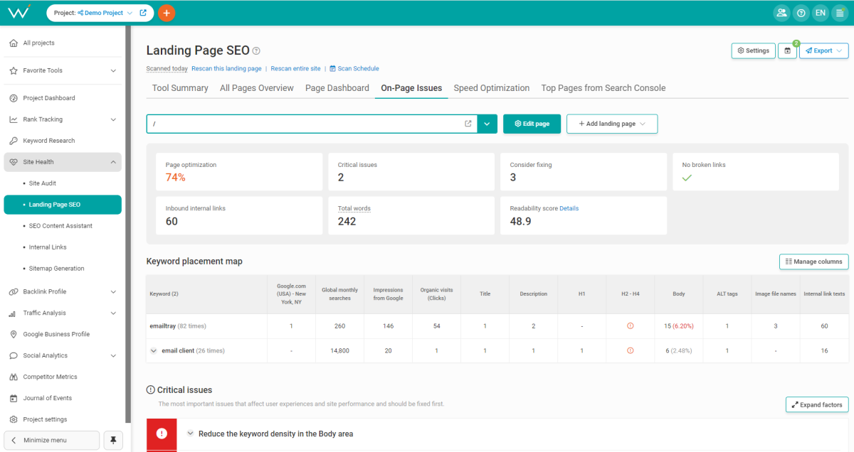
Images are an important element of the majority of websites. Therefore, you must ensure your images make your site stronger and don’t drag it down.
How do you optimize the images on your site?
Check if your images are missing anything by scanning your site with WebCEO’s On-Page Issues tool.
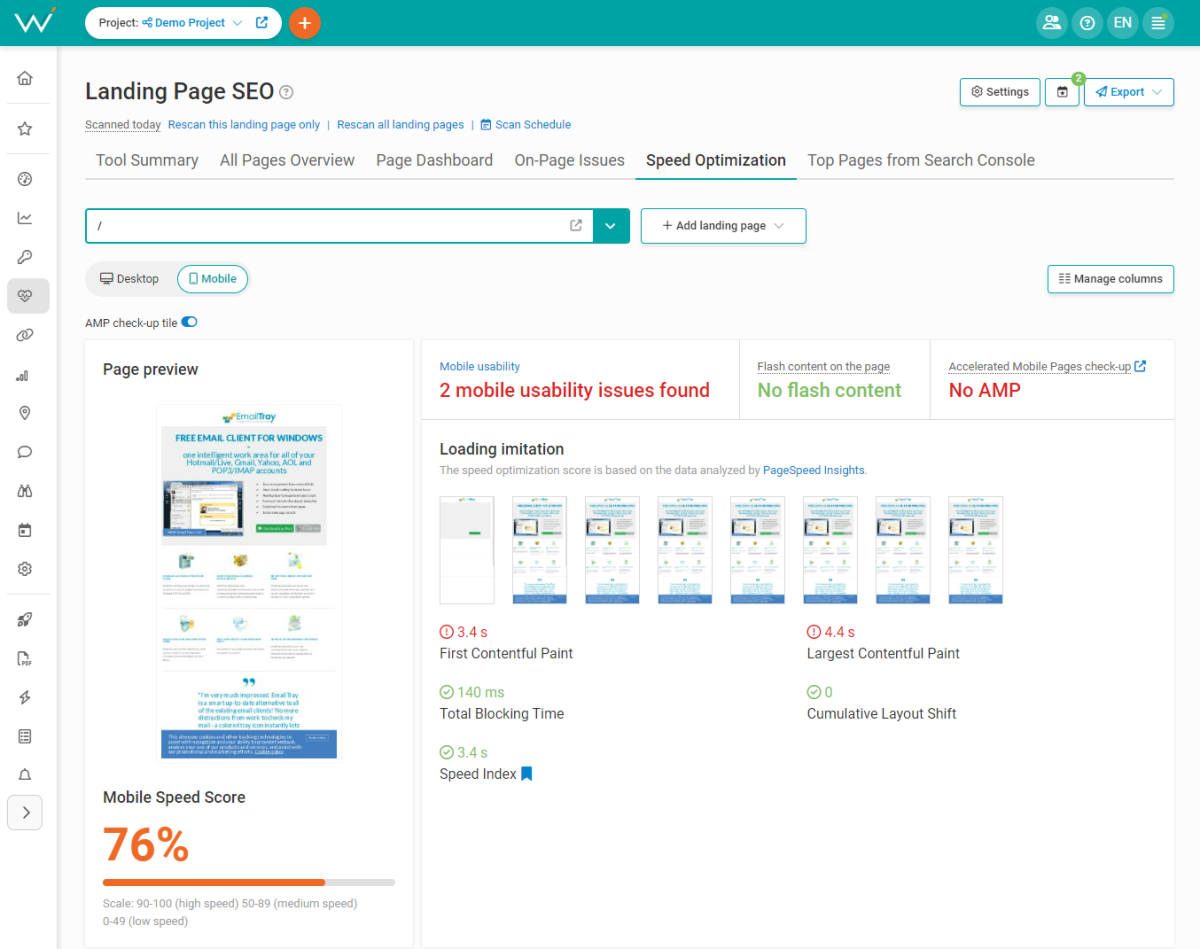
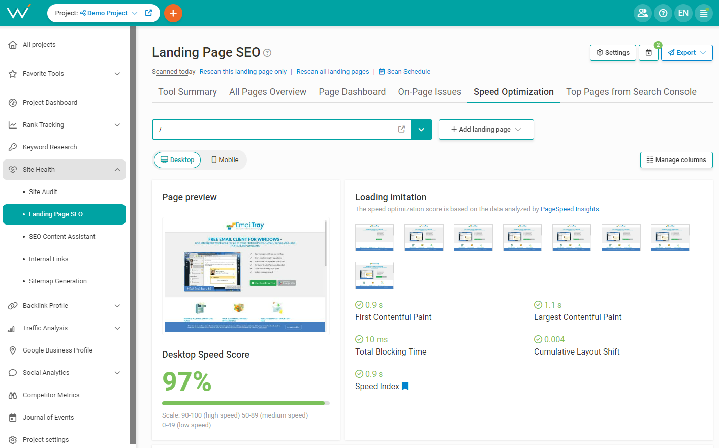
No web designer with an ounce of dignity wants to make a slow website. After all, it’s the best way to repel users and not get paid!
How do you make sure your site is a hare, not a tortoise?
Run a speed check on your site right now to see what you can improve. WebCEO’s Speed Optimization tool offers plenty of recommendations on increasing your site speed.
What is the absolute best way to make your site design more user-friendly? Listening to user feedback, of course!
Even if your users aren’t particularly vocal, don’t sweat it. There is a very reliable tool for finding the flaws in your site’s design: heatmaps.
What are heatmaps? They display user activity on your site: how users interact with it, which page elements they use (and how often), and which ones they ignore. Here’s an example:

Clearly, that one part with the faintest spots doesn’t get much action. Perhaps that part could be moved elsewhere, or the users don’t like how it looks, or they don’t need it at all – that’s for you, as a designer, to figure out.
To generate your own heatmaps, use a tool like CrazyEgg.
You shouldn’t forget about users who may have visual or hearing impairments. They are out there, they may come to your site, and you don’t want to alienate them. Your web design should be accessible – and that’s so important that Google actively encourages it.
How can you accommodate your website for users with disabilities?
And here’s a fun fact: CAPTCHA is not considered accessible. Just imagine how many users you will make happy by not having it.
As you can see, the secret to making an SEO-friendly web design is keeping the users’ best interests in mind. See things from their perspective and use the right tools to fine-tune your creation, and your website’s design will never end up in the list of your SEO problems.