Things That Kill Your Landing Page Conversions
3 min to read

A landing page is a page where traffic is sent specifically to perform a desired action. You can bring in traffic via PPC ads, banners, email newsletters and organic search traffic.
Nothing should distract visitors on their road to becoming your customers. Below are 5 common mistakes marketers make with their landing pages. We will tell you how to avoid them.
There is only one message and action on a good landing page. You should look at the page and have your eyes immediately drawn to the action area. The so called “paradox of choice” says that when given multiple options, the decision ends up being not to choose at all.
Make your desired action clear and distinctive. Do not place numerous offers or navigation on this page, nothing should draw the user into doing something else. If you need several choices (for example, different packages of your service), the goal is still single (visitors should choose a package). Ensure that all the choices are grouped together and can be considered the action area.
If you have content below the fold, repeat the call to action. Always make it easy and compelling for the visitor to take the desired action.
A headline is your chance to overcome attention filters your prospects may have because of modern information-overload. Focus on one thing you provide that your prospects feel is highly desirable. You should know the pain of your prospects and show them how you can relieve it.
Often, a good headline alone can boost the effectiveness of your landing page. Split-test different headlines and find which one brings you much higher conversions compared with others.
One of the best ways to make visitors take action is to create a sense of urgency. When your prospect feels that your proposition will expire soon or there is a limited number of copies, he/she will be more likely to act immediately.
Try adding a counter, showing how many copies left. Make your prospects feel that they should take action right now.
As social creatures, humans tend to place greater value on things that other people have already approved. Over 70% Americans say they look at product reviews before making a purchase. Nearly 63% of consumers indicate they are more likely to purchase from a site if it has product ratings and reviews.
Your testimonials should be real. Use testimonials that show how your product solves problems, common words like “it’s the best service ever” work less well.
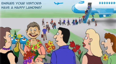
Remember to include a photo of the person giving the testimonial – researchers have discovered that a photo will increase trust among all participants, even if said photo was nonsensical (didn’t relate to the written content).
The most popular screen size in the USA still is 1024 x 768, – says our web statistics. You should remember this, because it’s important to keep the most essential parts of your message – logo, headline, call to action, a supporting visual – in the center top of the screen, with supporting messaging lower down on the page.
Avoid the above mistakes and make your landing pages convert better. Meanwhile, WebCEO Online will help you bring visitors through SEO and organic search.