WebCEO Dashboard Anatomy
4 min to read
Current chess engines are able to defeat even the strongest human players under normal conditions. However, when computers were less powerful, a human always won because a human chess player can intuitively determine what moves are worth paying attention to.

I have promised that I will spend less than 10 minutes a day with site analytics. It is safe to say that I am really fulfilling the promise. The WebCEO dashboard helps me to determine what data is worth paying attention and where I can outgame search engines.
There are three levels of dashboards in WebCEO, each giving you more details about the current situation with your sites.
You will see the Main Dashboard when you log into your WebCEO account. It’s a helicopter view of all the sites you are working on with WebCEO.
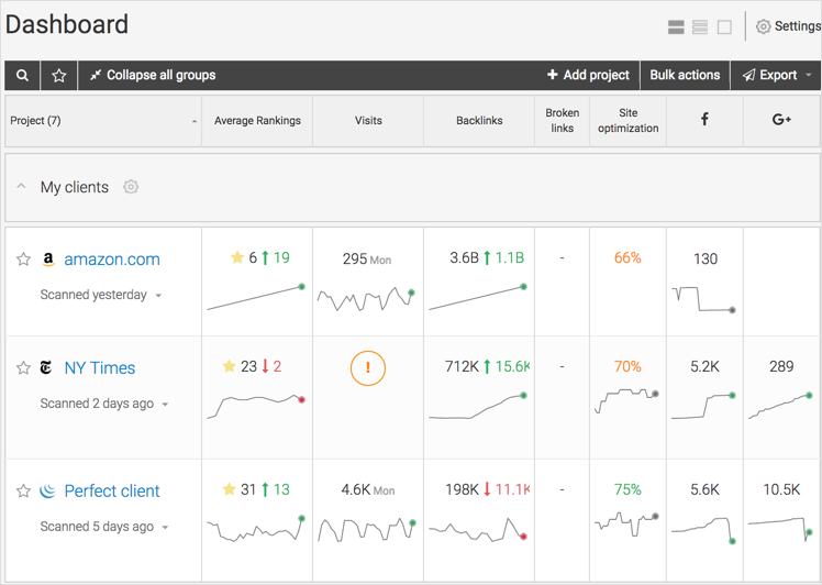
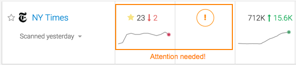
Here you can get the quickest idea of how your sites are doing. A quick tip is: if you see something in red – pay attention fast. Click on the cell with red numbers or arrows and you will be taken to a detailed report showing what has happened.
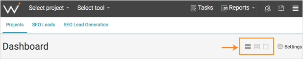
You can select a compact, standard or extended view for the most comfortable experience. The extended view is the best for mobile devices, you can easily surf the data with your fingers. The compact view helps you quickly scan dozens of sites and see where your attention is needed. The standard view is something in the middle 🙂
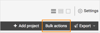
Another great thing about the WebCEO Dashboard is the ability to perform bulk actions. SEO agencies love this! Click the “Bulk actions” link right below the view icons and you will be able to rescan all selected projects simultaneously, change their properties and scan schedule at once, and even delete several projects at once, if you need.
The WebCEO product managers researched how professional SEO experts prefer to set their SEO dashboards. The results of this research were used to create the default Dashboard view. However, you can fine-tune Dashboards to fit your needs. Go to the Settings and check the columns you need. You can use different Dashboard views on your desktop and mobile, and you can add different columns on that different view. So you can have different Dashboards on your different devices!
The most interesting part of the Dashboard settings is the “Advanced tool settings” tab. Here you can polish data representation to perfection.
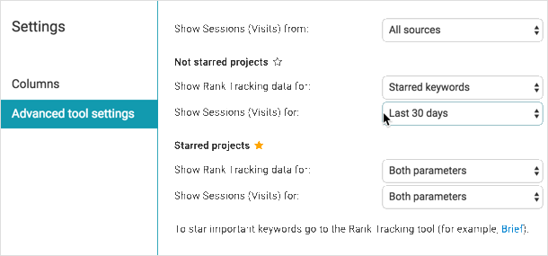
With the advanced settings you can set different presentation for starred and non-starred projects (I hope you know that you can click a star icon near a project/website in the Main Dashboard and this will mark the website as important).
To dig into more details about a specific project (in WebCEO we call your websites “projects”), click on its name in the Main Dashboard or select it through the Select project button at the top.

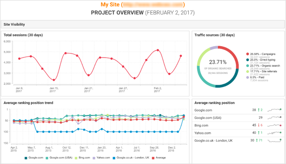
The Project Overview dashboard consists of widgets that summarize the information from all the tools you use. You can use the predefined widget sets: brief, standard or extended, or create your own sets.
Tip: if you work on client websites, create different widget sets to use for work and to use for reporting.
The Project Overview is great for reporting, because it is a summary from all tools. You can add and delete widgets, drag them in order to rearrange them, change their size or view to represent the information in the best way. The Project Overview can be printed, downloaded as a PDF or sent via email (check the Export button in the top right corner). You can also add it to the automatic consolidated report.

The third and the most specific in the WebCEO dashboard family is the Tool Summary. You can see the Tool Summary for almost all of the WebCEO tools.
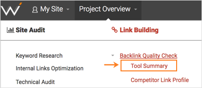
The Tool Summary dashboard consists of a widget set just like the Project Overview does. The only difference is that in the Tool Summary you will find only information from the specific tool in question. For example, you can use the Rank Tracking Tool Summary to investigate the ranking health of a site.
![]()
As with the Project Overview, the Tool Summary is great for client reporting because most clients do not want to forge through dense ranking tables. Beautiful graphs and diagrams will attract them and show that you are a professional who knows what is worth paying attention to. Remember that chess metaphor at the beginning?